SHISEIDOIntegrated Report 2020 Website
Beautifully delivered. An integrated report that embodies the company's philosophy
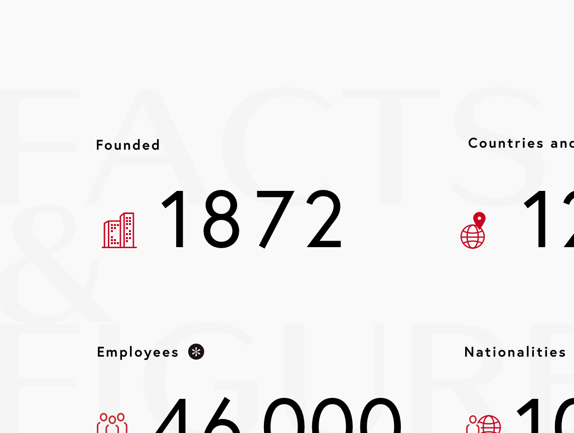
SHISEIDO is one of Japan's leading beauty companies and ranks fifth in global beauty company sales. In the fiscal year 2020, with the 150th anniversary of the company approaching, we upgraded the annual report to an integrated report. While communicating SHISEIDO's philosophy to a wide range of stakeholders, including those overseas, we achieved a user-friendly UI and UX design for investors so that the experience would not be compromised by digitalization.
Solution / Output
Marketing PlanningInformation ArchitectureUX ConsultingUX DesignDesign Language SystemContents DesignUI DesignArt DirectionFrontend DevelopmentProject ManagementMotion Design
Delivering SHISEIDO's philosophy to the world through the Integrated Report
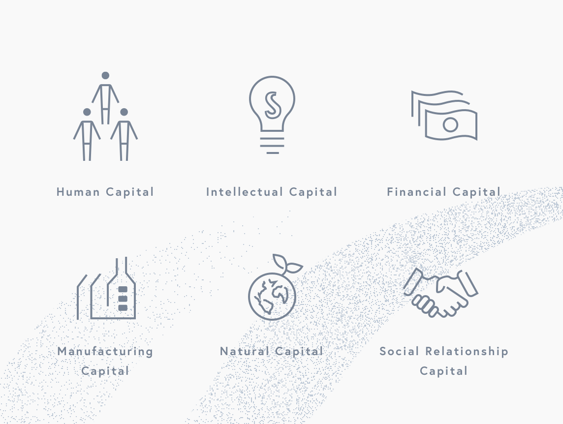
Integrated reports are an important tool for communicating with investors. They play a role in fostering a sense of trust and setting expectations for the company by sharing not only financial information, but also non-financial information such as the management vision and activity reports, while integrating them in an organic way.
SHISEIDO, whose mission statement is "Beauty innovations for a better world", wanted to increase sympathy for the SHISEIDO Philosophy to new investors both in Japan and abroad. For the 2020 fiscal year, due in part to the predicted reduction in printing demand related to the COVID-19 pandemic, the company has released an exclusively digital integrated report for the first time. The goal was to create a sophisticated brand experience one expects from a global company, without sacrificing readability even in a paperless format, and using interaction expressions that only digital presentation can provide.
SHISEIDO, whose mission statement is "Beauty innovations for a better world", wanted to increase sympathy for the SHISEIDO Philosophy to new investors both in Japan and abroad. For the 2020 fiscal year, due in part to the predicted reduction in printing demand related to the COVID-19 pandemic, the company has released an exclusively digital integrated report for the first time. The goal was to create a sophisticated brand experience one expects from a global company, without sacrificing readability even in a paperless format, and using interaction expressions that only digital presentation can provide.


A thorough design process from the investors’ perspective
We input the target investor information and design the website in a way that has sympathy for the investors’ perspective. The concept is “Beautifully delivered”. The interaction naturally guides you from one topic to the next as you read, allowing you to take in an abundance of content in a stress-free manner. The content was crafted in conjunction with a writer specializing in IR, and both the design and content were meticulously created from an investor's perspective.
In addition, an agile production management system was used to accommodate the nature of the project, one where information is continually updated until the announcement of financial results. By visualizing the complexity of the stakeholders, we responded to their needs with an efficient and complete flow.
In addition, an agile production management system was used to accommodate the nature of the project, one where information is continually updated until the announcement of financial results. By visualizing the complexity of the stakeholders, we responded to their needs with an efficient and complete flow.


Interactive expression of a high-quality worldview
We chose the "circles" as a motif to attractively convey that SHISEIDO is a Japanese brand that shines on the world stage. The use of SHISEIDO's red circle is a symbolic expression of its reliability as a Japanese brand. The permanence of the circle, which has no beginning and no end, and its soft style give the website a sense of quality. The circular motifs appear at a comfortable rhythm and also serve as an interactive element that encourages scrolling, allowing you to follow the topics in a flowing manner.
In addition, we also implemented features that allow for easy reading of the abundant content. There is a side navigation function that allows you to ascertain the entire page, a keyword function that allows you to check topics of interest, and a "viewed" function that lets you know what pages you have already seen. We have created a comfortable experience unique to this digital format that allows investors to gather information with ease.
The website received high praise from both clients and investors, and was awarded Gold and Silver prizes in four categories at the 2021 International ARC Awards, one of the world's largest annual report awards.

Client
Shiseido Company, Limited
Credit
- PRODUCE
- Shu UCHIDA
- CREATIVE DIRECTION
- Taishi YOKOYAMA
- DIRECTION
- Yuzo TAKEMOTO
- PROJECT MANAGEMENT
- Katsuya ICHIKAWA
- ART DIRECTION
- Tomoki TOI
- DESIGN
- Hiromi TANAKA , Yosuke NARITA , Huyen Vu , Nghi Huynh
- TECHNICAL DIRECTION
- Kenta SAKATA
Partner
- WRITING
- Griffin K
- PROOF READING
- SHUCHINSHA.
- TRANSLATION
- Queen & Co.
- DEVELOPMENT
- GRAPHIC Corporation.
- ILLUSTRATION
- Tetsuro HONDA